

The Countries That Fell Short at the Winter Olympic Games
Using economics to uncover which countries underperformed (and why)

You’re reading Monday Morning Economist, a free weekly newsletter that explores the economics behind pop culture and current events. Each issue reaches thousands of readers who want to understand the world a little differently. If you enjoy this post, you can support the newsletter by sharing it or by becoming a paid subscriber to help it grow:
Every few years, we end up having the same debate about which country actually “won” the Olympics. Is it the country with the most total medals, or the one with the most gold medals? The International Olympic Committee (IOC) doesn’t officially recognize a ranking of participating countries, but it still publishes medal tallies for comparison. Once a new set of Olympic Games begins, it doesn’t take long for the debate to start back up.
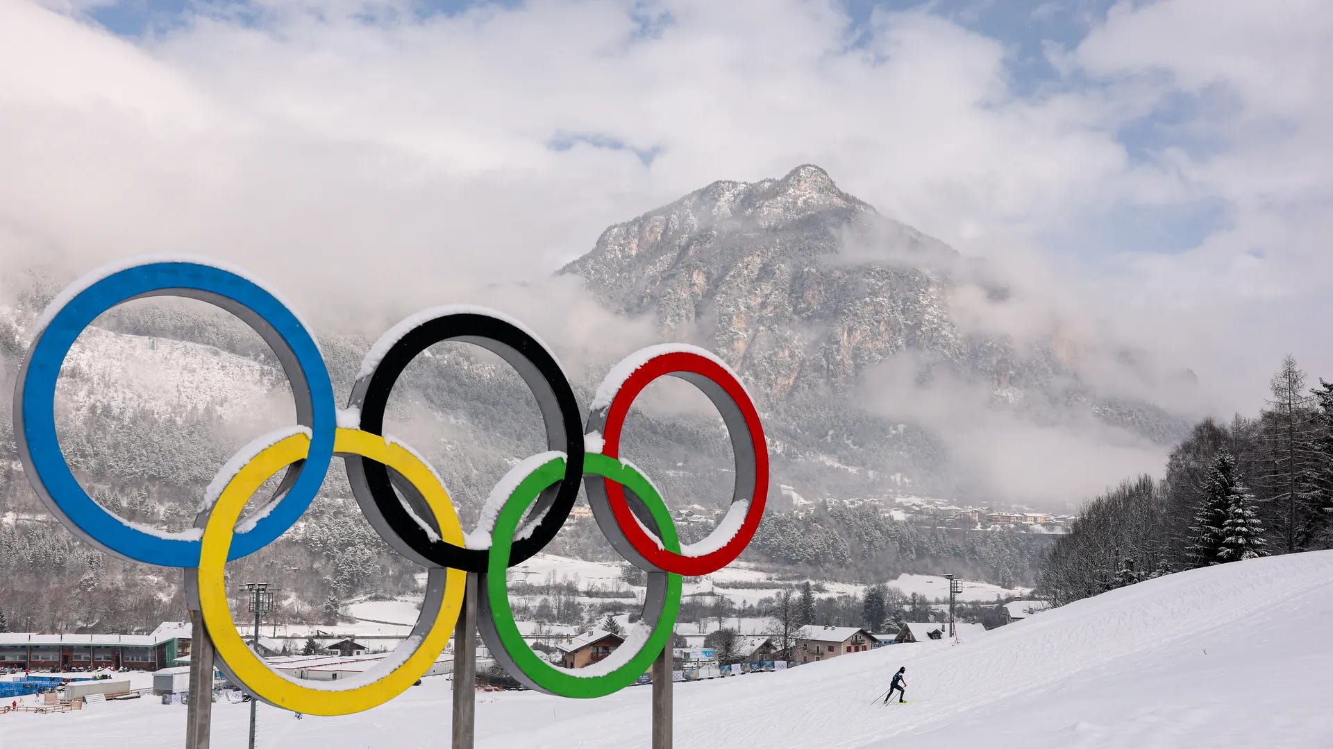
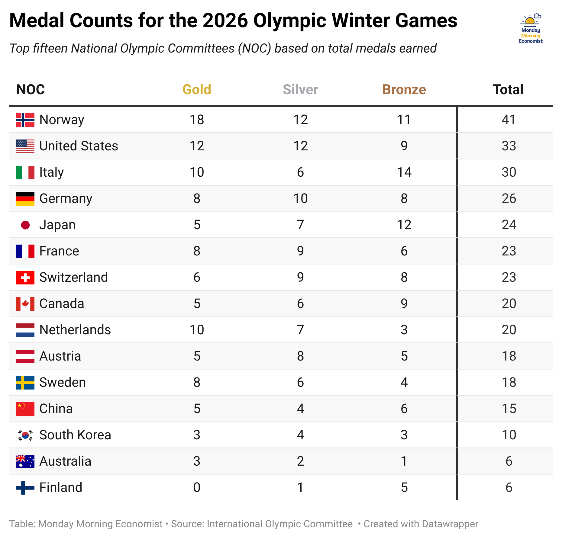
That debate tends to matter more in the Summer Olympics, where different rankings can lead to different answers. The Winter Olympics are a bit different. If you’ve watched them for long enough, you know one thing is true: Norway dominates.
It’s a country roughly the same size as Montana, with a population similar to Minnesota. And yet, it consistently piles up medals at a rate that far exceeds much larger countries, often leading in both total medals and golds.
So instead of asking who won based on medal counts, let’s ask a different question: Which countries should have won more medals… and didn’t?
Turning Medals Into an Economics Question
Economists tend to view Olympic success the same way we think about economic output for any industry. Countries “produce” medals using inputs like population (a larger talent pool) and income (the ability to invest in training and facilities). More resources generally lead to more output. Olympic medals are just another kind of output.
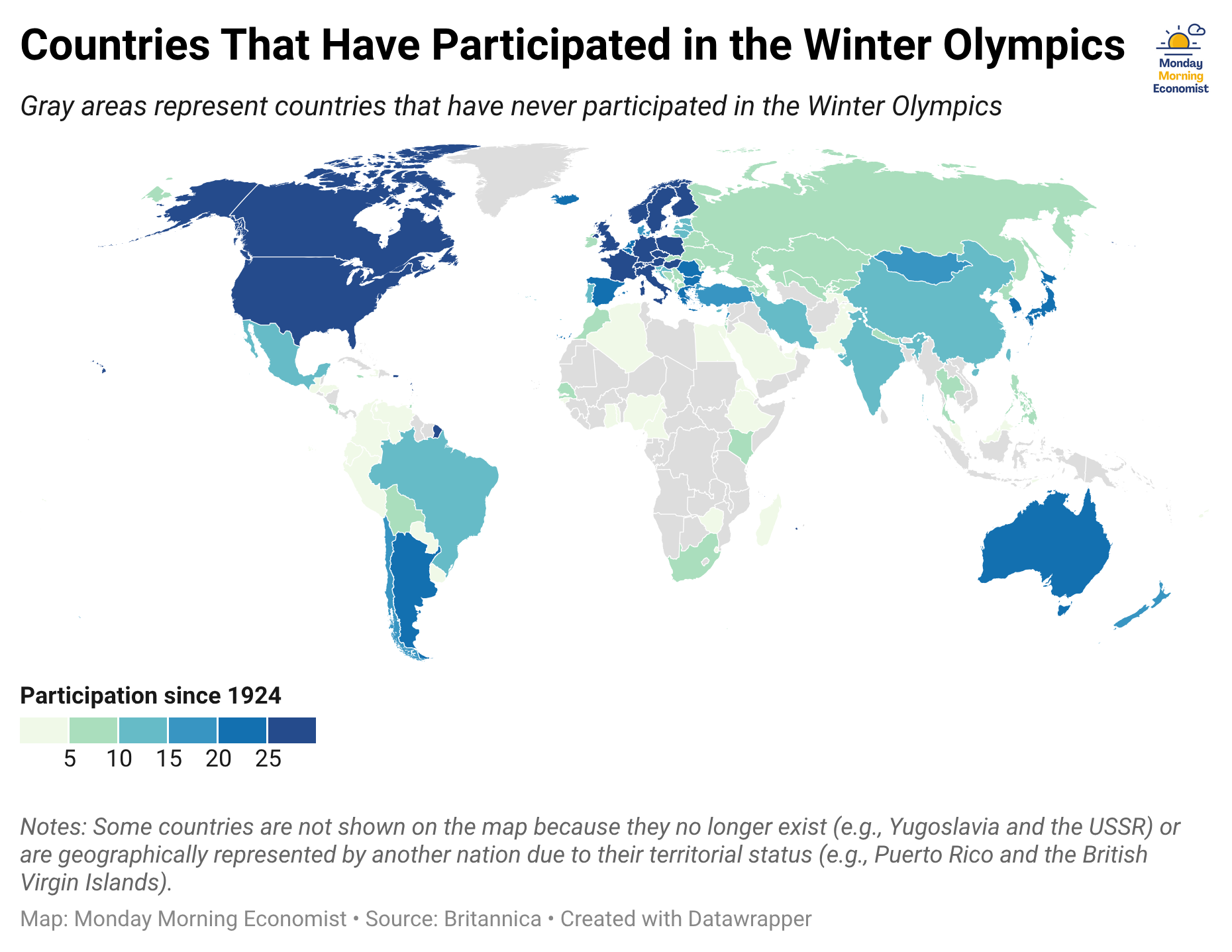
That concept was formalized in a 2004 paper by Andrew Bernard and Meghan Busse, who showed that population and income go a long way in explaining Olympic medal counts. Their work focused on the Summer Olympics, where most countries have access to the same sports. But the Winter Olympics are a little different. Not every country is built for snow and ice. The Jamaican bobsled team has been reminding us of this for decades.
Can We Predict the 2026 Olympics?
Over the weekend, I collected data from the 2014, 2018, and 2022 Winter Olympics to estimate how population and income relate to medal counts. I also included controls for whether a country was hosting and a measure of winter exposure based on latitude to capture potential geographic advantages. I initially tested whether broader institutional measures might explain medal performance, but they didn’t have any meaningful effect in this setting.
Once all that data was cleaned and fed into the model, I used those estimated relationships to predict medal counts for the 2026 Winter Olympics and scaled the predictions to match the total number of medals awarded.
From there, we can compare our predictions to the actual results. Countries that exceed expectations are overachievers, while those that fall short are underachievers.
The Countries That Fell Short
Let’s start with the biggest surprises. These are the countries that fell furthest below their predicted medal counts. If you don’t regularly watch the Winter Olympics, this list might be surprising.
Taken as a whole, these aren’t particularly small or poor countries. In fact, that’s exactly why a few of these show up on the list. Based on their population, income, and geography, the model expected several of these countries to win at least a dozen medals. Collectively, they won fifteen.
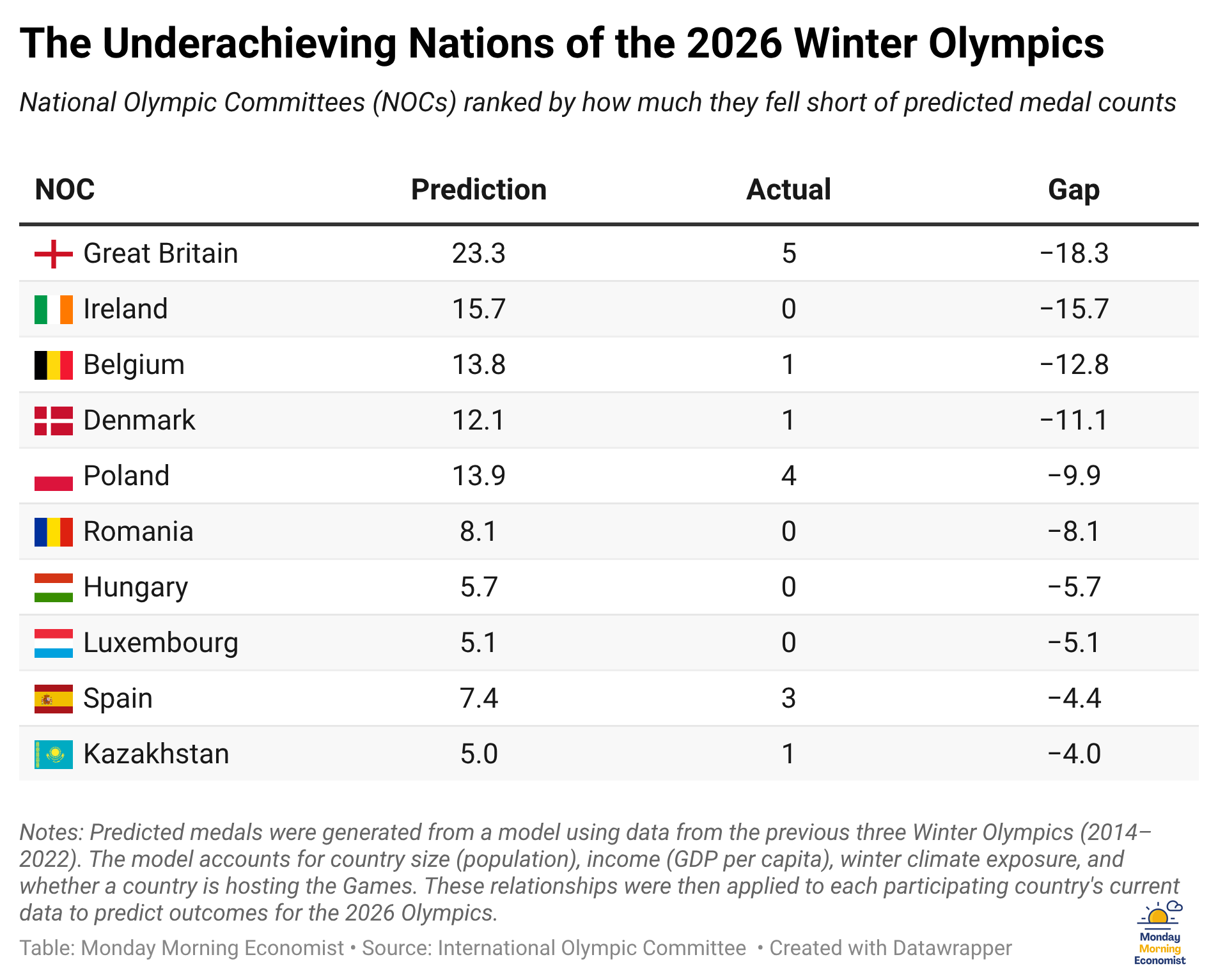
But a closer look helps explain part of the story. Some countries sent only a handful of athletes. For example, Ireland sent just four competitors. Even the best countries in the world would struggle to earn fifteen medals from just four athletes.
Others face structural constraints. Despite its size and wealth, Great Britain has limited access to consistent snow and ice infrastructure. That makes it harder to develop elite winter athletes year after year.
This doesn’t mean the model is wrong; it’s just incomplete. As statisticians like to remind us, all models are wrong, but some are useful. This one only gives us a foundation for what we might expect if countries converted their geography, population, and income into medals in the same way.
Our model doesn’t capture whether countries have chosen to invest in this athletic space in the first place. That’s where our story takes us next. While some countries may fall short of expectations, others consistently do the opposite.

The Countries That Delivered More Than Expected
Let’s now turn to the countries that exceeded expectations. It includes an interesting mix of countries that vary widely in population and income. By our estimates, they have all converted their resources into medals more effectively than expected.
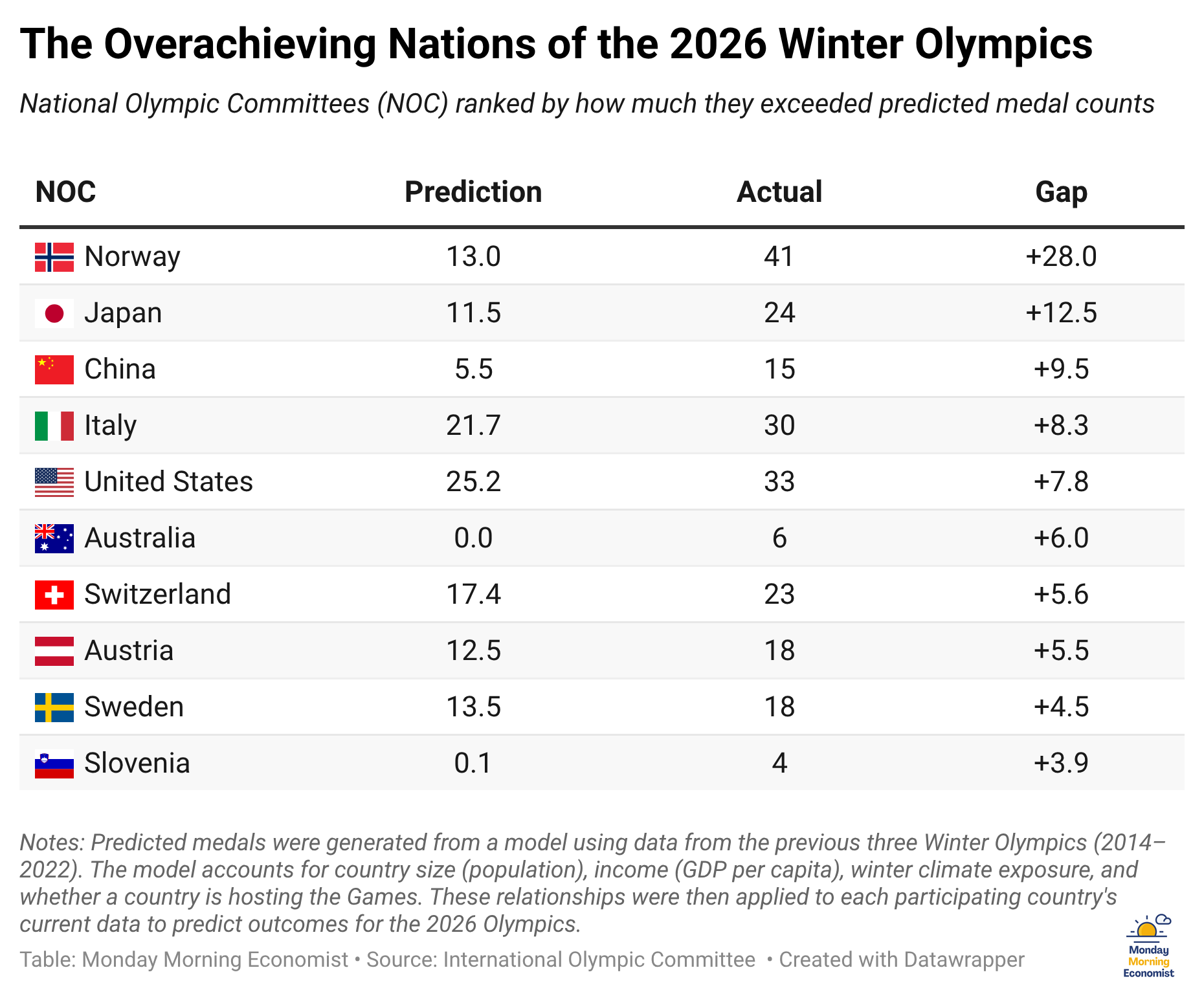
Some of this makes intuitive sense. Italy came out near the top, but that’s not uncommon for host countries. The United States, China, and Japan all have the scale and resources to support large Olympic programs, but even they managed to outperform expectations.
And then there’s Norway.
Our model predicted that Norway would earn roughly 13 medals, roughly the same as its neighbor Sweden. Norway would shatter its own winter records with more than triple that amount, while Sweden produced a few more than expected.
Both countries have similar economic profiles. While Sweden has a larger population, Norway has a higher level of per capita income. Both are firmly in the part of the world where winter sports are part of everyday life.
Similar region. Similar inputs. Similar predictions.
Very different outcomes.

Absolute vs. Comparative Advantage
Norway isn’t just producing winter medals. It specializes in them. And that’s what separates it from countries like Sweden. Both are producing a large number of elite athletes. Both have the resources, climate, and experience to compete at a high level. But Norway has gone a step further, consistently turning those advantages into medal-winning performances.
Our results reflect a broader economic story about how countries “produce” Olympic success.
Let’s start with what economists call absolute advantage. Countries with larger populations and higher incomes simply have more resources to work with. A bigger population creates a deeper talent pool, while higher income supports better training, coaching, and facilities. In our model, a 10% increase in population is associated with roughly half an additional medal, while doubling income per person is associated with about six additional medals.
But as Norway and Sweden show us, having more resources isn’t enough. What matters is how those resources are used.
Comparative advantage helps explain why countries with similar resources can end up with very different outcomes. Countries specialize in what they’re relatively better at producing. In the Winter Olympics, that advantage often comes from geography. Cold climates and consistent access to snow and ice make it easier to develop athletes in sports like skiing and biathlon.
But geography isn’t the whole story.
Institutions matter too. Some countries have built systems that identify talent early and invest in long-term development. Those systems don’t show up directly in population or income, but they play a key role in turning resources into results.
This helps explain both sides of our results. Countries like Great Britain and Ireland have the resources, but not the same environment or institutional support for winter sports. Countries like Norway combine both geographic advantages and sustained investment to consistently exceed expectations.
Final Thoughts
So who “won” this year’s Olympics? That depends on who you ask. If we shift the narrative from who won the most medals to who exceeded expectations, the answer becomes less obvious and a lot more interesting.
Norway still stands out, not just for winning the most medals, but for continuing to outperform what its size and economy would predict. But it’s not the only contender. Italy shattered its previous record while hosting. The United States outperformed expectations and captured one of the most visible moments of the Games with its hockey victories. And countries like Australia showed that countries can still medal even without a natural winter climate.
That’s what this approach highlights. It doesn’t replace the medal table, but adds another way to interpret it. Even for the countries labeled as underachievers, competing at this level is an extraordinary accomplishment. The goal is simply to help us understand why the results look the way they do.
If you found this perspective interesting, there’s a good chance someone else in your network will too. Feel free to share this with a friend or colleague who enjoys the Olympics, or just likes seeing how economics shows up in everyday conversations.

The first Winter Olympic Games were held in 1924 in Chamonix, France [International Olympic Committee]
Norway has won the most gold medals at every Winter Olympics dating back to Vancouver 2010 [NBC Olympics]
Ireland has sent a total of 36 athletes to the Winter Olympics since 1992 [Olympic Federation of Ireland]
Through mid-competition, NBC is averaging approximately 23.9 million to 26.5 million daily viewers in the U.S. across platforms, a 90%–93% increase over the 2022 Beijing Games [KSL.com]
American athletes earn $37,500 for gold, $22,500 for silver, and $15,000 for bronze medals [USA Today]
Australia has mountains with ski resorts. Not many skating rinks, though.
This was smart and fun to read, thank you! My one note: When you said, "The United States outperformed expectations and captured one of the most visible moments of the Games with its hockey victory," you meant "victories," right?